





One common challenge for enterprise teams is that most JavaScript charting libraries are optimized for basic dashboards. They simply aren’t built to handle fast real-time data, complex custom work, or very large datasets.
What works fine for everyday blog or marketing visuals often collapses in high-stakes settings — think financial trading systems, scientific instruments, or factory monitoring. Those tiny delays and restricted chart types can slow operations noticeably.
Enterprise teams often run into the same issue: most JavaScript charting libraries are built mainly for simple dashboards. They struggle with real-time data streams, heavy customization needs, or visualizing truly massive datasets.
Tools that work well for basic blog stats or marketing reports usually fall short in demanding environments like financial trading platforms, scientific instruments, or industrial monitoring systems. Even small rendering delays or a limited selection of charts can create serious bottlenecks.
Quick Comparison
Scan this table to match your enterprise requirements with each library’s core strengths and licensing model.
| Firm | Chart Types & Specializations | Performance & Rendering | Best For | Open Source / Licensing |
| SciChart | Real-time scientific, financial, 3D charts | GPU-accelerated rendering engine | Data-dense aerospace, oil & gas apps | Proprietary commercial license |
| Apache ECharts | 20+ types, stream loading support | Canvas/SVG progressive rendering | Large dataset visualization at scale | Apache 2.0 open source |
| Plotly | 70+ types, Dash framework integration | WebGL for 3D, GPU acceleration | Full-stack analytical web applications | MIT open source core |
| amCharts | 60+ types, 50+ financial indicators | Canvas-powered high-performance rendering | Complex dashboards, financial analysis | Free + commercial licensing |
| Fusioncharts | 95+ types, 1400+ geographic maps | SVG rendering, responsive optimization | Rapid deployment, multi-framework projects | Commercial license, free trial |
| Highcharts | Stock, Gantt, Maps, Grid modules | SVG rendering with accessibility focus | Specialized enterprise workflows, timelines | Commercial license required |
Top 6 JavaScript Chart Libraries
The right charting library affects build speed, visuals, and data handling. Below, six top options compared—from GPU-accelerated to open-source.
SciChart
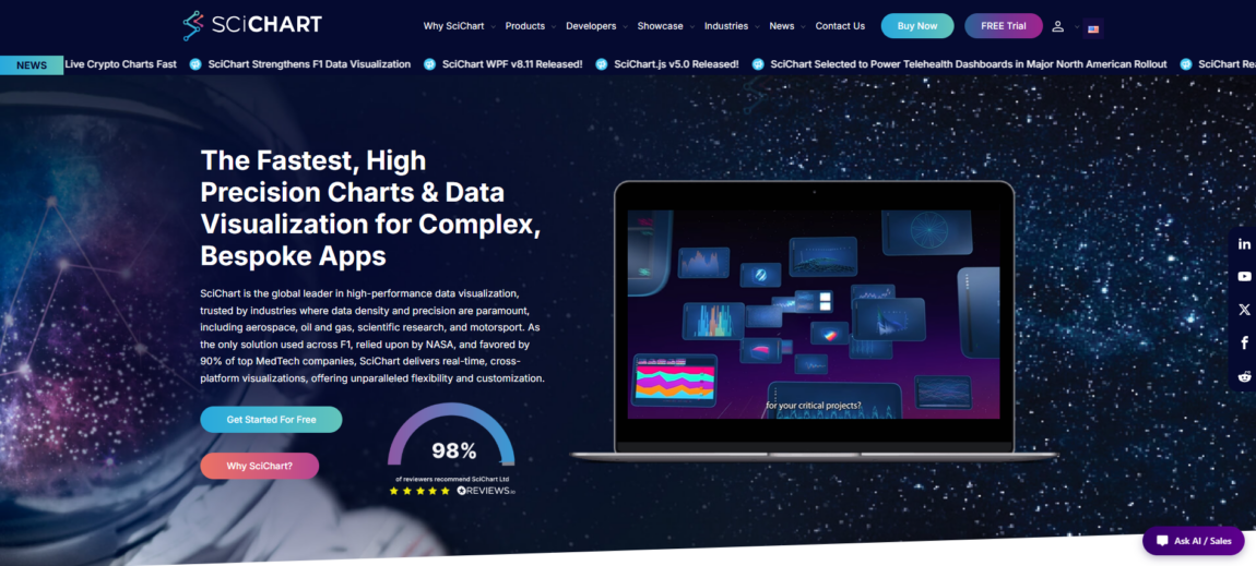
SciChart stands out as the best JavaScript chart library for demanding environments. Founded back in 2012, it quickly became the go-to choice for industries where every millisecond counts and massive datasets would overwhelm most standard tools.
Aerospace, oil and gas, and scientific research teams rely on SciChart’s proprietary engine to render millions of data points without lag or dropped frames. Unlike typical dashboard libraries, it’s built for high-stakes applications demanding dense data and rapid refresh rates.
Its GPU-accelerated rendering offloads heavy work to the graphics card, delivering smooth panning, zooming, and real-time updates—even with live telemetry or sensor data. Plus, with support for WPF, iOS, Android, and JavaScript, you can reuse the same visualization logic across desktop, mobile, and web.
SciChart consistently outperforms competitors in benchmarks for speed, large datasets, and complex visuals. If your project can’t afford to compromise on performance, it’s absolutely worth it.
Key features:
- GPU rendering handles millions of data points without lag
- Cross-platform deployment: WPF, iOS, Android, JavaScript
- Trusted by aerospace and scientific research since 2012
- Proprietary engine optimized for real-time streaming data
Why Choose This Library
SciChart tackles a real pain point: delivering strong rendering performance when you’re working at enterprise scale. If your app handles live sensor streams, high-frequency financial data, or complex scientific simulations with hundreds of thousands of data points, its GPU acceleration keeps everything smooth and responsive.
What’s particularly useful is the multi-platform design. You can write the visualization code once and use it across desktop tools, mobile monitoring apps, and web dashboards without having to rewrite the rendering logic each time.
Teams in regulated industries especially value the precision and long-term reliability that comes from over a decade of focused development in demanding environments.
Apache ECharts
Since 2012, ECharts has been an Apache project offering 20+ chart types with dual Canvas and SVG rendering. It adapts automatically to data volume and device constraints—Canvas for large scatter plots and heatmaps, SVG for highly detailed, smaller visualizations.
Progressive rendering and stream loading allow smooth handling of massive datasets. Charts update incrementally and stay interactive during slow queries.
Fully open source with strong community support, it eliminates licensing issues. Its declarative syntax keeps dashboards readable, and animations handle real-time data cleanly.
ECharts provides production-ready tools you can fork and deploy freely, without vendor contracts.
Key features:
- Canvas and SVG dual-engine rendering for performance flexibility
- Progressive loading handles datasets exceeding 1M points smoothly
- Declarative config syntax reduces boilerplate for complex dashboards
- Apache 2.0 license permits commercial use without restrictions
- Active GitHub community with 60k+ stars and weekly updates
Why Choose This Library
Teams managing real-time dashboards and data-intensive apps turn to ECharts for reliable open-source performance. Progressive rendering supports fast-updating monitoring tools, financial dashboards with thousands of securities, and dense scientific visualizations—without custom WebGL.
It integrates easily across vanilla JavaScript, React, Vue, and Angular.
Apache Foundation governance ensures long-term stability and freedom. You get enterprise charting tools that you can host, modify, and deploy to fit your compliance needs.
Plotly
Since its founding in 2013, Plotly has grown into much more than a simple charting tool. With 70+ chart types, it turns visualization into a complete analytics environment.
The Dash framework is a big reason why teams like it. You can build full interactive dashboards using Python or R, without juggling multiple tech stacks. Everything works together cleanly behind the scenes.
On top of that, Plotly Studio brings AI assistance so non-coders can dig into datasets, generate visuals, and share results easily. When it’s time to go live, Plotly Cloud manages scaling, security, and teamwork—exactly what you need once dashboards move from prototypes to critical business tools.
Key features:
- 70+ chart types, including scientific, financial, and 3D visualizations
- Dash framework eliminates the need for separate backend/frontend stacks
- AI-powered Studio for no-code exploration and rapid prototyping
- Enterprise Cloud deployment with SSO, audit logs, and role-based access
- Open-source core with commercial support tiers
Why Choose This Library
Plotly solves the charting library vs. analytics platform choice by offering both. Use the open-source JavaScript library for basic charts, or Dash for complete apps that handle data, visuals, and deployment together.
It avoids common integration issues. AI Studio speeds up analysis for non-technical users, and Cloud provides ready enterprise security and collaboration tools.
amCharts
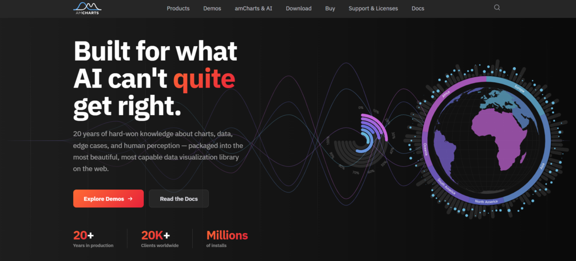
Founded in 2006, amCharts has become a trusted data visualization platform for over 20,000 companies. With 60+ chart types, it covers standard visuals as well as advanced financial charts featuring built-in indicators like RSI, MACD, Bollinger Bands, and volume analysis.
This depth means teams can build trading platforms, portfolio dashboards, and executive reports without combining multiple libraries.
Its Canvas rendering provides excellent performance for heavy dashboards and real-time updates, while maintaining strong WCAG accessibility. The platform also includes interactive maps, Gantt timelines, and data grids, allowing enterprises to use one vendor for diverse visualization needs.
Key features:
- 60+ chart types from basics to financial indicators (MACD, RSI, Bollinger)
- Canvas rendering outperforms SVG competitors on dense datasets
- Maps, Gantt, and grid modules unify dashboard tech stack
- 20,000+ companies rely on two decades of platform stability
- WCAG-compliant accessibility baked into rendering engine
Why Choose This Library
Teams creating trading platforms, analytics dashboards, or executive reports with mixed financial, geographic, and timeline visuals appreciate amCharts’ unified platform. It eliminates the need for multiple libraries, reducing vendor risk and simplifying maintenance.
Canvas rendering supports real-time data and complex animations while maintaining accessibility for regulated environments. Two decades of development deliver a mature API, thorough documentation, and well-handled edge cases.
Fusioncharts
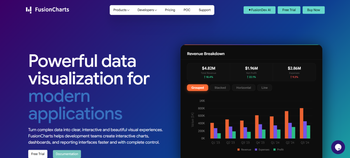
Fusioncharts provides 95+ chart types and 1,400+ geographic maps, giving teams immediate access to financial charts, heatmaps, treemaps, and other specialized visuals without extra development work.
It includes over 20 pre-built dashboards that speed up deployment from months to days. Responsive rendering works automatically across devices, and integration with React and Angular stays straightforward using native components.
The configuration API offers simple setups for basic needs and deeper control when required. It’s a practical choice for organizations focused on fast time-to-market rather than maximum rendering optimization.
Key features:
- 95+ chart types cover financial, scientific, and geographic use cases
- 20+ dashboards ship production-ready analytics interfaces immediately
- Native React/Angular components eliminate wrapper complexity
- Responsive design handles mobile-to-desktop without manual tuning
- Extensive customization API balances simplicity with control depth
Why Choose This Library
Go with FusionCharts if your roadmap needs fast deployment of diverse visualizations across multiple frameworks. The broad selection of charts, pre-built dashboards, and easy integration helps shorten development cycles for analytics portals, internal BI tools, and SaaS reporting platforms.
Organizations managing React, Angular, and mobile apps benefit from consistent APIs that reduce overhead for developers. Plus, with over 1,400 geographic maps included, you can often skip separate mapping tools and keep everything in one place.
Highcharts
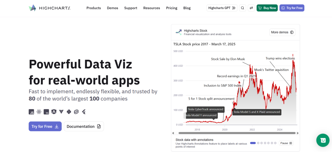
Highcharts comes with targeted modules that handle common enterprise requirements: stock charts for finance, Gantt charts for projects, maps for location-based data, a solid grid for tables, and composable dashboards.
Its modular design lets you load only what you need, which keeps things lightweight without breaking the consistent API. Teams also appreciate the strong emphasis on accessibility and the company’s reliable support for longer projects.
Integration is straightforward with React, Angular, and Vue. Plus, everything from financial tools to timelines and data grids works under one license.
Key features:
- 20+ chart types with official wrappers for React, Angular, Vue, TypeScript, Flutter, Python, Svelte, and Node.js
- Specialized modules: Stock (financial/trading), Maps (geospatial), Gantt (project planning)
- Highly customizable, responsive, and mobile-friendly
- Highcharts Orbit AI: forecasting, anomaly detection, automated insights, and AI chat
- Production-ready, accessible, backed by 12K+ GitHub stars and heavy npm usage
Why Choose This Library
Highcharts is a strong choice for teams that need a mature, feature-rich charting library with broad framework support and extensive visualization options.
Its combination of ease of implementation, customization flexibility, dashboards, maps, financial charts, and enterprise reliability makes it particularly well-suited for business intelligence platforms, SaaS products, analytics tools, and reporting applications.
Conclusion
Choosing the right enterprise charting solution isn’t just about scanning feature lists. Different teams have different priorities — some focus on GPU-powered real-time rendering, others want open-source flexibility or a rich set of charts and financial indicators.
Start by assessing your data sizes, real-time needs, customization complexity, framework compatibility, and budget.
The right pick ultimately delivers good speed, keeps development efficient, and stays maintainable for years to come.




More Stories
6 PPF Installers in Chicagoland for Daily, Luxury and Performance Cars
5 Essential Forex Trading Platforms in 2026
Best Instagram Follower Tracker 2026: Top Picks for September